Choosing wedding colors is one of the easiest ways to establish the overall mood of your celebration. Your palette can influence everything from invitations and bridesmaid dresses to flowers, table settings, wedding cake details, and reception décor. While classic combinations remain popular, couples are also exploring softer neutrals, earthy shades, romantic pastels, rich jewel tones, and unexpected color pairings that feel personal and modern.
The season of your wedding can be a helpful starting point when selecting your colors. Spring often works beautifully with fresh pastels and soft greens, while summer allows brighter and more playful combinations. Autumn naturally suits warm earth tones, deeper greens, and muted oranges, while winter creates an opportunity for elegant neutrals, jewel tones, and metallic accents. These trending wedding color ideas for each season can help you create a cohesive look while still leaving plenty of room to personalize your celebration.
1. Spring: Sage Green and Blush Pink
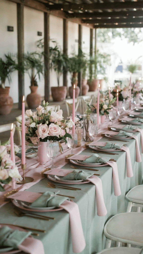
Sage green and blush pink create a soft, romantic palette that works beautifully for spring weddings. The muted green brings a natural, botanical feeling, while blush adds warmth and a delicate romantic touch.
Use sage green for bridesmaid dresses, stationery details, napkins, or greenery throughout the venue. Blush pink can appear in bouquets, floral arrangements, table linens, candles, and small reception details.
For a balanced look, add ivory or warm white as a neutral base. This prevents the palette from feeling too colorful while allowing the main shades to stand out.
This combination works especially well for garden weddings, outdoor ceremonies, romantic brunch receptions, and venues with plenty of natural light. It can also be adapted easily for rustic, minimalist, or elegant wedding themes.
Palette: Sage green + blush pink + ivory + soft gold
2. Spring: Lavender and Butter Yellow
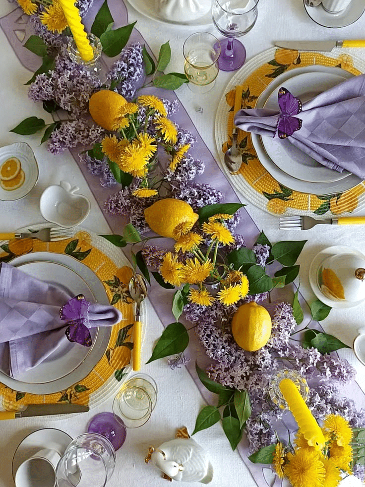
Lavender and butter yellow offer a cheerful alternative to traditional spring wedding palettes. Lavender brings a soft floral quality, while pale yellow adds warmth and optimism without becoming overwhelming.
You can use lavender in bridesmaid dresses, invitations, floral arrangements, and ceremony details. Butter yellow works beautifully in small accents such as ribbons, table stationery, candles, napkins, or selected flowers.
Keep the overall palette soft by pairing both colors with cream or ivory. If you want a slightly more sophisticated finish, introduce muted green through foliage and floral stems.
This palette is particularly lovely for garden weddings and daytime celebrations. It can also create a playful but refined look for couples who want something different from traditional blush and white.
Palette: Lavender + butter yellow + ivory + soft green
3. Spring: Dusty Blue and Peach
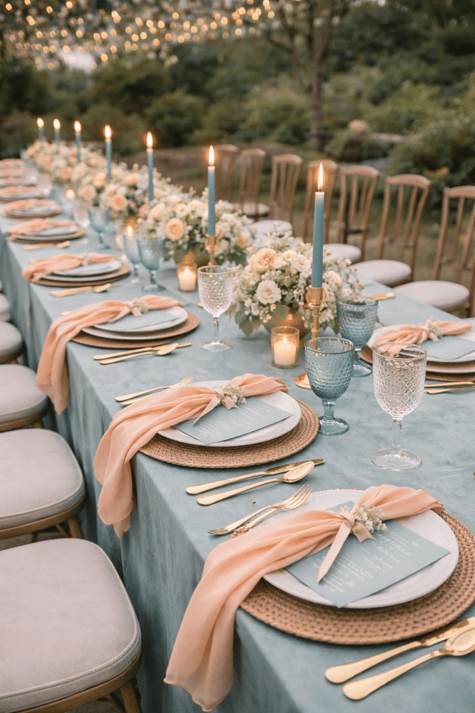
Dusty blue and peach create a balanced spring palette by combining a cool, calming shade with a warm, soft accent. The result feels romantic without being overly traditional.
Dusty blue can be incorporated through bridesmaid dresses, paper goods, table runners, or decorative details. Peach works beautifully in floral arrangements, bouquets, candles, and reception accents.
Add creamy white to keep the palette light and airy. Natural greenery can also help connect the colors to the spring season.
This combination works well for outdoor ceremonies, coastal venues, garden receptions, and elegant indoor spaces. It is especially useful if you want your wedding colors to feel colorful while remaining understated.
Palette: Dusty blue + peach + cream + greenery
4. Summer: Coral and Turquoise
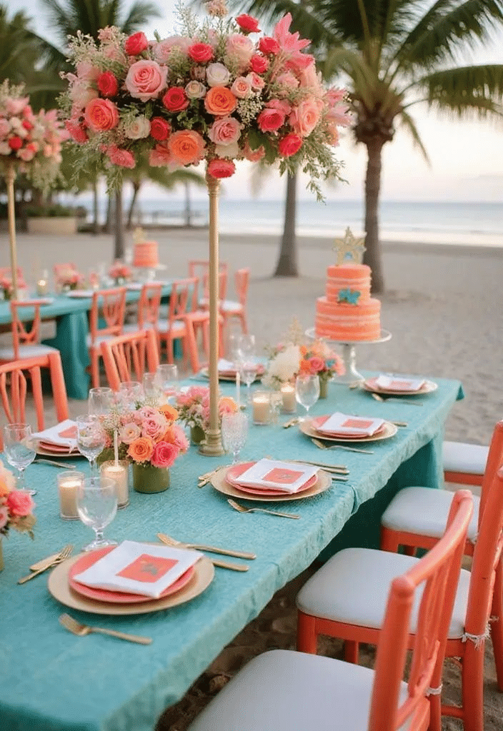
For a bright summer wedding, coral and turquoise can create an energetic and cheerful atmosphere. These colors work particularly well for beach weddings, destination celebrations, outdoor receptions, and tropical-inspired events.
Coral can be used in flowers, bridesmaid accessories, menus, candles, or table arrangements. Turquoise can appear in stationery, glassware, ribbons, signage, or small decorative accents.
Because both shades are strong, balance them with white, ivory, or sandy beige. You do not need to use both colors equally. Choosing one as the main color and the other as an accent can create a more polished result.
Add natural textures such as rattan, linen, woven details, or light wood for a relaxed summer aesthetic.
Palette: Coral + turquoise + ivory + sandy beige
5. Summer: Peach, Cream, and Terracotta
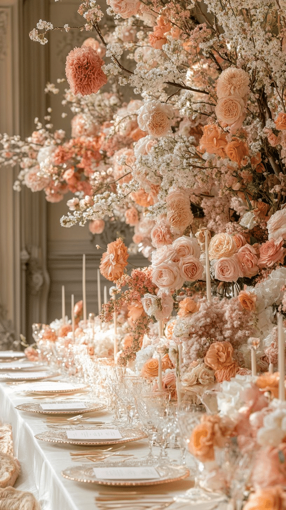
Peach, cream, and terracotta offer a warmer summer palette with an earthy feel. Peach keeps the combination soft and romantic, while terracotta introduces depth and character.
This palette works beautifully with dried flowers, neutral linens, ceramic tableware, wooden details, and warm candlelight. Peach can dominate the floral arrangements, while terracotta appears in stationery, napkins, bridesmaid accessories, or decorative accents.
Cream provides the visual breathing room needed to keep the warmer colors from becoming too heavy.
This combination works for backyard weddings, vineyard celebrations, boho-inspired ceremonies, and modern outdoor receptions. It can also transition nicely from summer into early autumn.
Palette: Peach + terracotta + cream + warm beige
6. Summer: Sky Blue and White
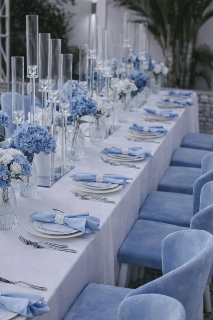
Sky blue and white create a clean and refreshing summer wedding palette. The combination is especially fitting for coastal, outdoor, garden, and destination weddings.
Use white as the main foundation and introduce sky blue through bridesmaid dresses, table stationery, ribbons, glassware, flowers, or reception signage.
You can add a small amount of pale green to bring a botanical element into the palette. For a coastal wedding, natural beige and sandy tones can also work beautifully.
This color combination is versatile because it can feel casual or elegant depending on the materials you choose. Crisp white linens and delicate blue details create a sophisticated look, while natural textures make the same colors feel more relaxed.
Palette: Sky blue + white + pale green + sandy beige
7. Autumn: Terracotta and Olive Green
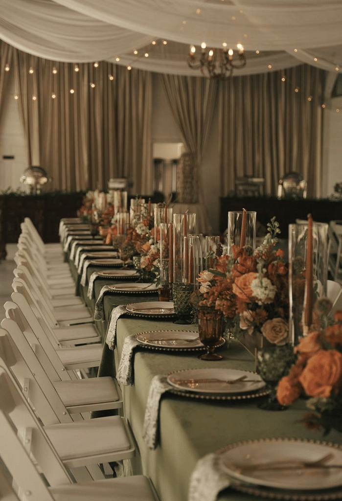
Terracotta and olive green are natural choices for an autumn wedding. Terracotta brings warmth and richness, while olive green adds an earthy botanical element.
Use terracotta in floral arrangements, bridesmaid dresses, table runners, candles, or stationery. Olive green works well through foliage, napkins, signage, and subtle decorative details.
Add cream or warm beige to soften the combination. Wooden textures, dried flowers, copper accents, and candlelight can complement the palette beautifully.
This color scheme works especially well for barn weddings, outdoor ceremonies, vineyards, rustic venues, and intimate fall receptions. It can also be adapted into a more modern look by using clean stationery and minimalist floral arrangements.
Palette: Terracotta + olive green + cream + warm beige
8. Autumn: Burgundy and Dusty Rose
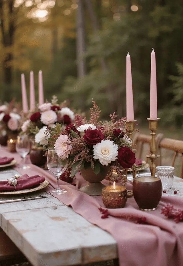
Burgundy and dusty rose create a romantic autumn palette with a sophisticated feel. Burgundy provides depth, while dusty rose keeps the overall combination soft and elegant.
Use burgundy selectively through flowers, bridesmaid dresses, napkins, menus, or candles. Dusty rose can be incorporated into floral arrangements, ribbons, stationery, and smaller reception details.
Add champagne, ivory, or taupe as a neutral shade to prevent the darker color from dominating.
This palette works particularly well for evening weddings, historic venues, elegant ballrooms, and candlelit receptions. It can also pair beautifully with gold or brass details for an elevated autumn look.
Palette: Burgundy + dusty rose + ivory + champagne
9. Winter: Emerald Green and Champagne
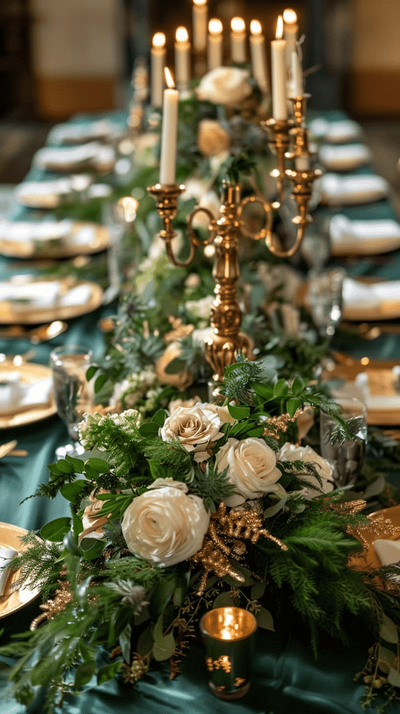
Emerald green and champagne create a rich winter palette that feels elegant without relying entirely on traditional red. Emerald provides a deep seasonal color, while champagne adds warmth and a subtle metallic quality.
Emerald can appear in bridesmaid dresses, velvet table linens, stationery, or floral foliage. Champagne can be introduced through candles, tableware, invitations, ribbons, or metallic details.
Keep the rest of the décor relatively neutral so these colors remain the focus. White flowers, evergreen foliage, warm lighting, and gold-toned details can complete the look.
This combination is especially suitable for formal winter weddings, hotel receptions, evening ceremonies, and elegant holiday-season celebrations.
Palette: Emerald green + champagne + ivory + warm gold
10. Winter: Navy Blue and Silver
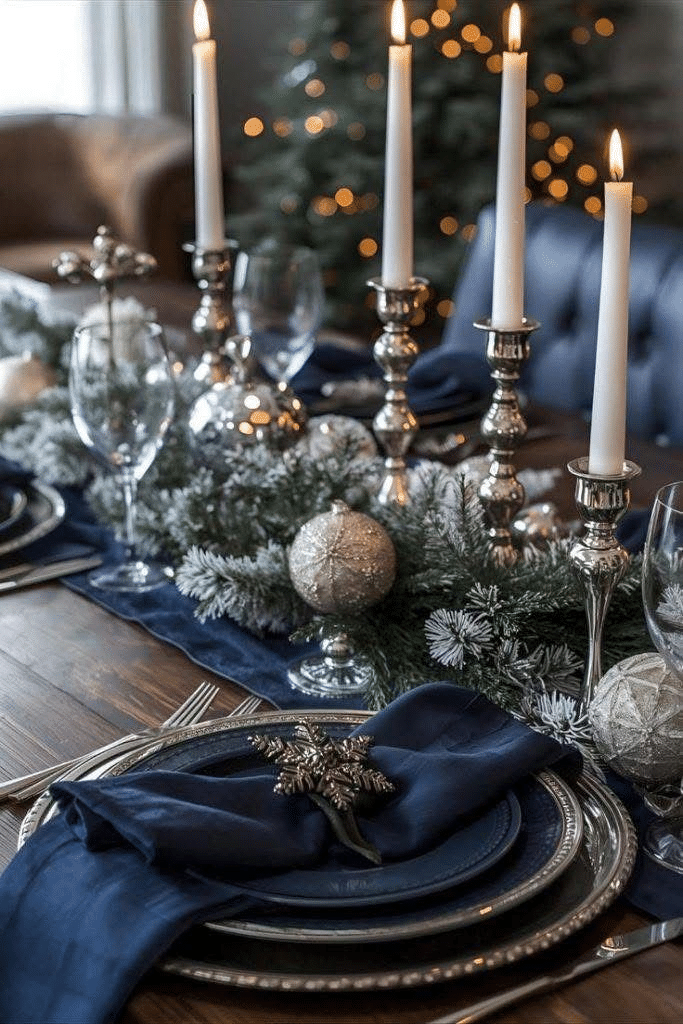
Navy blue and silver create a sophisticated winter palette with a crisp, elegant appearance. Navy provides depth and contrast, while silver adds brightness and a subtle seasonal shimmer.
Use navy in stationery, bridesmaid dresses, suits, table linens, or signage. Silver can appear in candleholders, tableware, invitations, ribbons, and small decorative details.
White or ivory flowers can soften the darker tones, while greenery adds a natural element.
For a modern winter wedding, keep metallic accents minimal and pair navy with clean white details. For a more glamorous celebration, introduce crystal-inspired décor, reflective surfaces, or silver-toned candles.
Palette: Navy blue + silver + white + greenery
How to Choose Wedding Colors by Season
Your wedding season can provide inspiration, but it does not have to determine your entire palette. Start by choosing one or two colors you genuinely love, then build supporting shades around them.
Think about your venue, wedding style, flowers, attire, and lighting. A color that looks beautiful outdoors during daylight may feel completely different in an indoor evening reception.
It can also help to create a small mood board before ordering anything. Include flower photos, fabric samples, stationery, table settings, and venue images. This allows you to see whether the colors work together before making major purchases.
Finally, remember that your wedding does not need to follow a strict seasonal formula. You can use winter jewel tones in spring or soft pastels in autumn if they fit your personal style. The season is simply a useful starting point for creating a cohesive design.
Summary
The right wedding color palette can bring your entire celebration together, from the ceremony to the reception tables. Spring works beautifully with soft greens, blush, lavender, and pastel yellow, while summer opens the door to fresh blues, coral, peach, and turquoise. Autumn naturally complements terracotta, olive, burgundy, and dusty rose, while winter suits elegant combinations such as emerald and champagne or navy and silver.
Choose colors that complement your venue and wedding style while reflecting your personal preferences. A thoughtful palette does not need to be complicated—two main colors, one or two supporting shades, and a neutral foundation can create a beautiful and cohesive result.
FAQ
1. What are popular spring wedding colors?
Soft sage green, blush pink, lavender, butter yellow, dusty blue, peach, ivory, and soft green are versatile choices for spring weddings.
2. What colors work well for a summer wedding?
Summer weddings can suit fresh combinations such as coral and turquoise, sky blue and white, peach and cream, or soft terracotta palettes.
3. What are good autumn wedding colors?
Terracotta, olive green, burgundy, dusty rose, warm beige, cream, and champagne can all work beautifully for autumn celebrations.
4. What colors are suitable for winter weddings?
Emerald green, champagne, navy blue, silver, ivory, and deep jewel tones can create an elegant winter wedding palette.
5. How many colors should a wedding palette have?
A simple wedding palette can include two main colors, one or two supporting shades, and a neutral such as ivory, white, beige, or cream.
6. Should wedding colors match the season?
Not necessarily. Seasonal colors can provide inspiration, but your wedding colors can be based on your personal style, venue, flowers, and overall theme.
7. How can I make my wedding colors look cohesive?
Repeat your chosen colors across several details, such as invitations, flowers, attire, table settings, signage, and reception décor. Using consistent shades and neutral elements can help everything feel connected.
8. Can I use metallic colors in my wedding palette?
Yes. Gold, champagne, silver, and brass can work well as accent colors. Using them selectively can add dimension without overwhelming the main palette.
SEO Description
Explore 10 trending wedding color ideas for every season, from spring pastels and summer brights to autumn earth tones and elegant winter palettes.